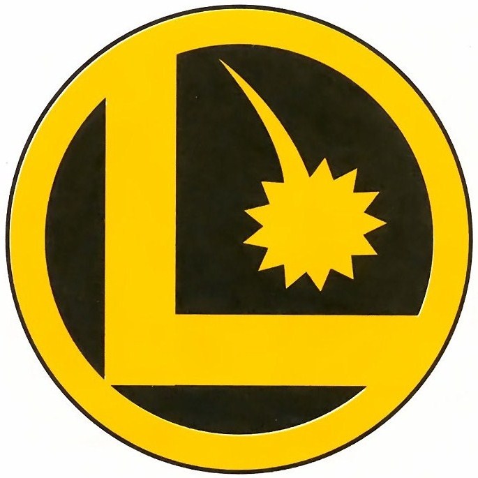
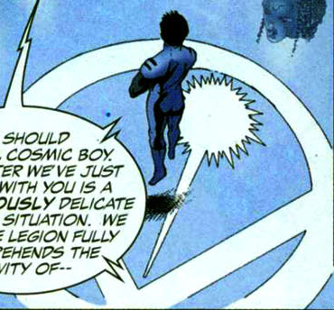
While rereading the first issue of the threeboot Legion I remembered something that I’d noticed a while back about the Legion logo. The old logo has a ‘shooting star’ above the ‘L’ with the star falling while the threeboot logo has the star shooting up. Does anyone know if there’s any significance to that change? Check it out after the break.


On my “god I’m a geek” © scale this post gets a:

I totally know the significance, but I’m not going to tell.
Wow, I couldn’t even type that line with a straight face. Ha!
Are you trolling my site? Aren’t there any Harry Potter sites you can post on?
I dare you to read the Harry Potter books and then blog about them. Then I wouldn’t be considered a troll because I could actually contribute substantial posts. So until then, I’m going to troll away. Remember, you’re the one who gave me this link. Classic mistake.
1. I might read the HP books. MIGHT.
2. Did you know all comments have to be OK’d by the website Admin before they are published?
1. I might read the HP books. MIGHT.
2. Did you know all comments have to be OK’d by the website Admin before they are published?