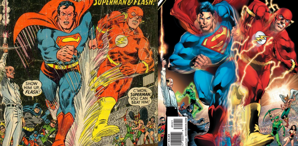
left side: Superman V1 #199 (August 1967) :: right side: Action Comics #892 (August 2010)
I was looking at the variant cover to next week’s Action Comics and something looked weird. The poses of the super-hero spectators look off to me. I checked the original cover which this issue is an homage to and I wasn’t surprised to see that the original is much better. Let’s break this down by character:
(Click here for a bigger version of the comparison picture)
- Superman’s grimace has been changed to a smirk. The dude is running against the Fastest Man Alive, I expect him to be exerting a bit.
- The blur effect. Thanks, like I can’t tell that the two characters are moving fast from the speed lines.
- Robin: OK
- Alfred: I kinda like the new version.
- Batman: The new version’s pose makes so sense. Is he reaching out towards Superman? What’s with the text bubble hate on the new version?
- The Atom: I guess the new version is scared of being stepped on.
- Green Lantern: The new version much be shorter than the old one because he decided he needs to fly in order to see the action.
- Martian Manhunter and Aquaman: Sorry, no White Lanterns allowed.
- Green Arrow: This is the character pose that got the ball rolling. The new version has him posing like he just shot an arrow. The original version makes more sense, he is holding the bow with the string side out. He is not shooting an arrow, he’s just throwing his arm up in celebration.
- Hawkman: Copy/paste the Green Lantern entry.
- Wonder Woman: OK

12. None of these characters is actually in Action #892, so maybe they should have used this variant cover on some other comic…
Yup, these 75th anniversary homage covers seem tacked on without rhyme or reason.