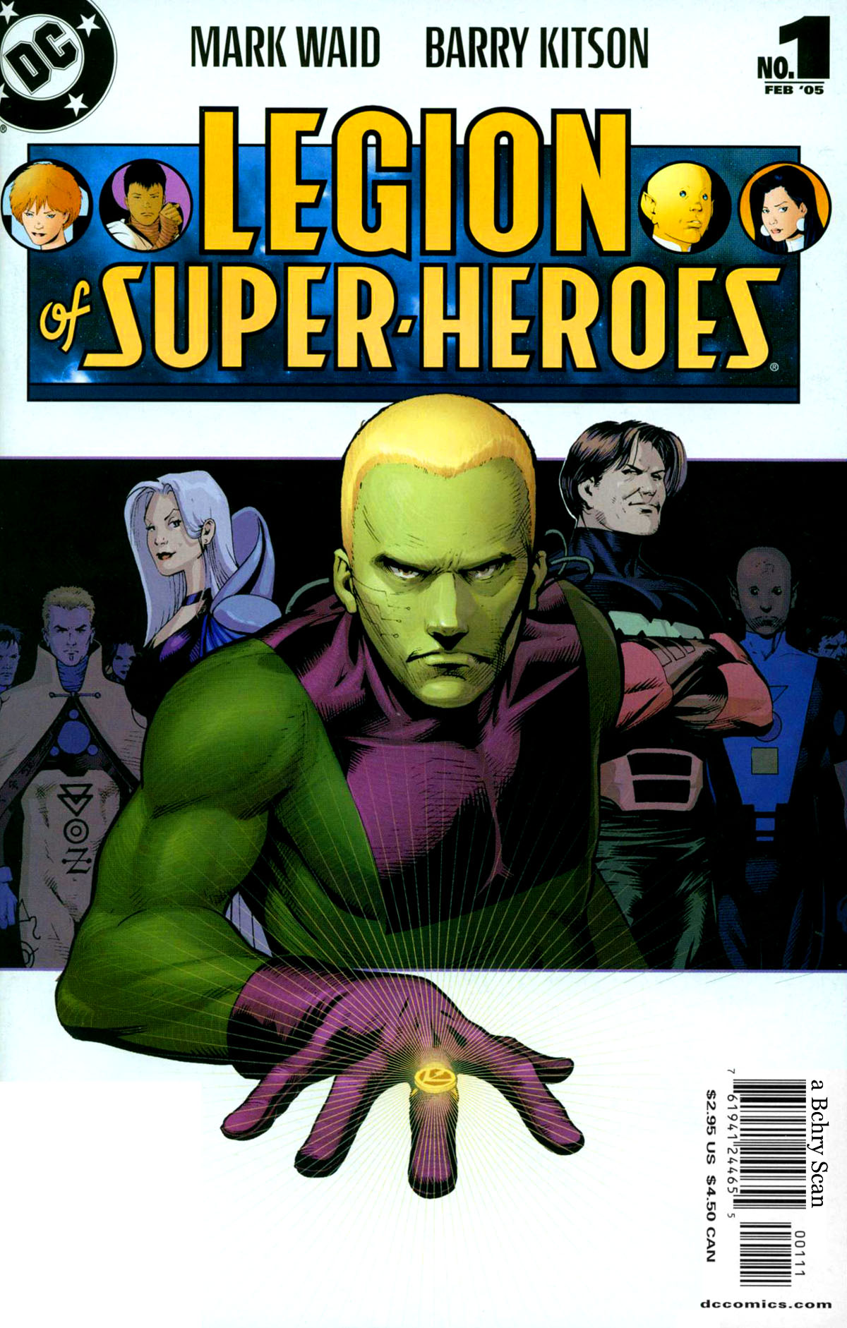
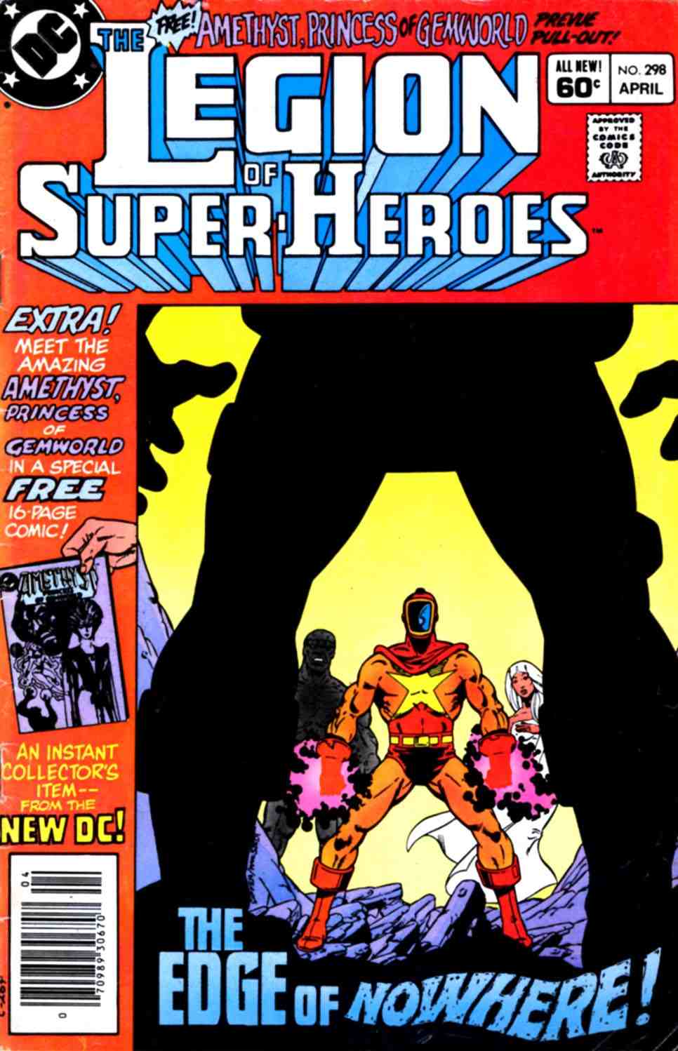
While rereading the first issue of the threeboot Legion I remembered something that I’d noticed a while back about the Legion logo. The old logo has a ‘shooting star’ above the ‘L’ with the star falling while the threeboot logo has the star shooting up. Does anyone know if there’s any significance to that change? Check it out after the break.
Author: Andres
Legion of Super-Heroes #1 Feb. 2005
I won’t lie: I really like the threeboot Legion. There’s no Legion-on-Legion snark in this issue so instead I’ll give some reasons why I think this version of the Legion rocks.
Legion of Super-Heroes #298 April 1983
Wildfire, Dawnstar, Blok, Invisible Kid 2, and Mysa the White Witch are sent to the mining operation on Asteroid 73-Q to investigate some strange occurrences.
Legion Illustration Commission
Hey guys, this is the first post on the new website! Nothing seemed to have exploded either. Good stuff. Well, I commissioned Joshua Crisalli to draw me a illustration of the threeboot founders. The rough draft behind the cut:
Adventure Comics #320
Dev-Em visits the 30th century to cause some trouble for the Legion….maybe.


